AE 07: Finishing Pivoting StatSci Majors
Packages
Goal
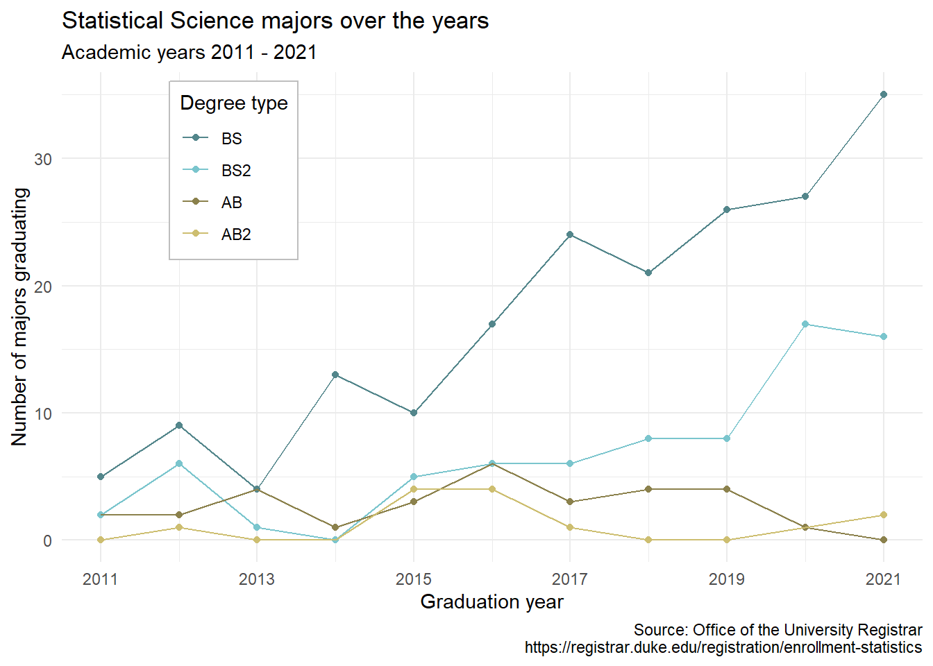
Our ultimate goal in this application exercise is to make the following data visualization.
Data
The data come from the Office of the University Registrar. They make the data available as a table that you can download as a PDF, but I’ve put the data exported in a CSV file for you. Let’s load that in.
The first column (variable) is the degree, and there are 4 possible degrees: BS (Bachelor of Science), BS2 (Bachelor of Science, 2nd major), AB (Bachelor of Arts), AB2 (Bachelor of Arts, 2nd major). The remaining columns show the number of students graduating with that major in a given academic year from 2011 to 2021.
Take a look at the origional data set….
Data In
statsci <- read_csv("data/statsci.csv")Rows: 4 Columns: 13
── Column specification ────────────────────────────────────────────────────────
Delimiter: ","
chr (1): degree
dbl (12): id, 2011, 2012, 2013, 2014, 2015, 2016, 2017, 2018, 2019, 2020, 2021
ℹ Use `spec()` to retrieve the full column specification for this data.
ℹ Specify the column types or set `show_col_types = FALSE` to quiet this message.slice(statsci)# A tibble: 4 × 13
id degree `2011` `2012` `2013` `2014` `2015` `2016` `2017` `2018` `2019`
<dbl> <chr> <dbl> <dbl> <dbl> <dbl> <dbl> <dbl> <dbl> <dbl> <dbl>
1 1 Statisti… NA 1 NA NA 4 4 1 NA NA
2 2 Statisti… 2 2 4 1 3 6 3 4 4
3 3 Statisti… 2 6 1 NA 5 6 6 8 8
4 4 Statisti… 5 9 4 13 10 17 24 21 26
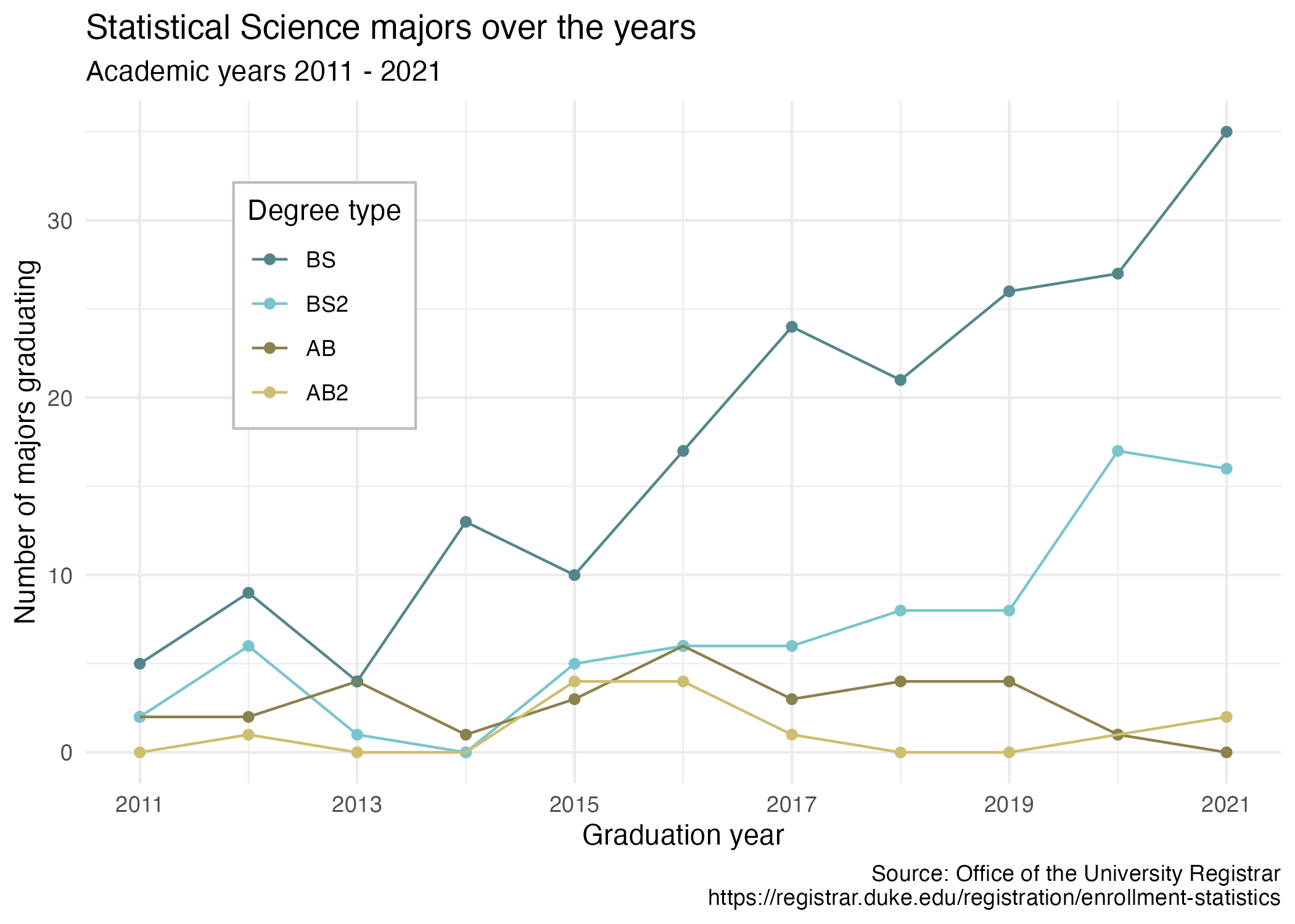
# … with 2 more variables: `2020` <dbl>, `2021` <dbl>Last class, we got this point where we making the following draft plot. Below, please talk through the code as a sentence to situate ourselves
statsci |>
  pivot_longer(
    cols = !c(id,degree),
    names_to = "year",
    names_transform = as.numeric,
    values_to = "n"
  ) |>
  mutate(n = if_else(is.na(n), 0, n)) |>
  separate(degree, sep = " \\(", into = c("major", "degree_type")) |>
  mutate(
    degree_type = str_remove(degree_type, "\\)"),
    degree_type = fct_relevel(degree_type, "BS", "BS2", "AB", "AB2")
    ) |>
  ggplot(
    aes(x = year, y = n, color = degree_type)
  ) +
  geom_point() +
  geom_line()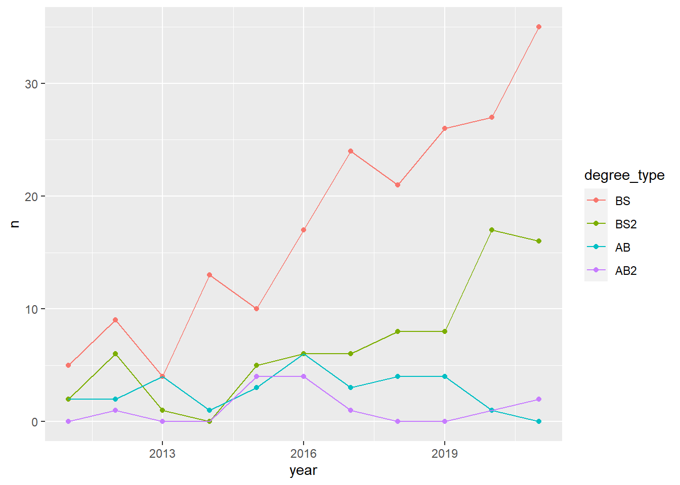
- Your turn (4 minutes): What aspects of the plot need to be updated to go from the draft you created above to the Goal plot at the beginning of this application exercise.
Axis, legend, color, labels
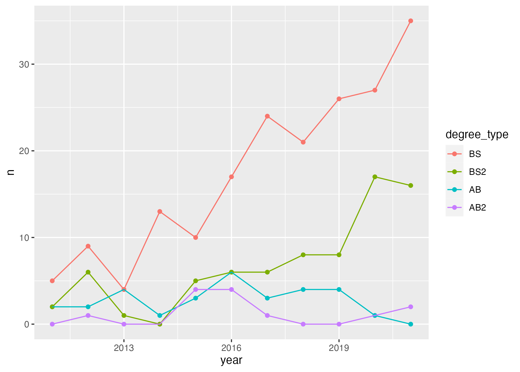
- Demo: Update x-axis scale such that the years displayed go from 2011 to 2021 in increments of 2 years. Do this by adding on to your pipeline from earlier.
statsci |>
  pivot_longer(
    cols = !c(id,degree),
    names_to = "year",
    names_transform = as.numeric,
    values_to = "n"
  ) |>
  mutate(n = if_else(is.na(n), 0, n)) |>
  separate(degree, sep = " \\(", into = c("major", "degree_type")) |>
  mutate(
    degree_type = str_remove(degree_type, "\\)"),
    degree_type = fct_relevel(degree_type, "BS", "BS2", "AB", "AB2")
    ) |>
  ggplot(aes(x = year, y = n, color = degree_type)) +
  geom_point() +
  geom_line() +
scale_x_continuous(breaks = seq(2011,2021,2))-
Demo: Update line colors using the following level / color assignments. Once again, do this by adding on to your pipeline from earlier. Hint: we can use
scale_color_manualwhen we want to manually set colors!“BS” = “cadetblue4”
“BS2” = “cadetblue3”
“AB” = “lightgoldenrod4”
“AB2” = “lightgoldenrod3”
statsci |>
  pivot_longer(
    cols = !c(id,degree),
    names_to = "year",
    names_transform = as.numeric,
    values_to = "n"
  ) |>
  mutate(n = if_else(is.na(n), 0, n)) |>
  separate(degree, sep = " \\(", into = c("major", "degree_type")) |>
  mutate(
    degree_type = str_remove(degree_type, "\\)"),
    degree_type = fct_relevel(degree_type, "BS", "BS2", "AB", "AB2")
    ) |>
  ggplot(aes(x = year, y = n, color = degree_type)) +
  geom_point() +
  geom_line() +
  scale_x_continuous(breaks = seq(2011, 2021, 2)) +
  scale_color_manual(values = c("BS" = "cadetblue4", "BS2" = "cadetblue3", "AB" = "lightgoldenrod4", "AB2" = "lightgoldenrod3"))
Now, let’s fix the labels and add theme_minimal to the plot!
statsci |>
  pivot_longer(
    cols = !c(id,degree),
    names_to = "year",
    names_transform = as.numeric,
    values_to = "n"
  ) |>
  mutate(n = if_else(is.na(n), 0, n)) |>
  separate(degree, sep = " \\(", into = c("major", "degree_type")) |>
  mutate(
    degree_type = str_remove(degree_type, "\\)"),
    degree_type = fct_relevel(degree_type, "BS", "BS2", "AB", "AB2")
    ) |>
  ggplot(aes(x = year, y = n, color = degree_type)) +
  geom_point() +
  geom_line() +
  scale_x_continuous(breaks = seq(2011, 2021, 2)) +
  scale_color_manual(
    values = c("BS" = "cadetblue4",
               "BS2" = "cadetblue3",
               "AB" = "lightgoldenrod4",
               "AB2" = "lightgoldenrod3")) +
  labs(x = "Graduation year",
       y = "Number of majors graduating",
       color = "Degree type",
       title = "Statistical Science majors over the years",
       subtitle = "Academic year 2011-2021",
       caption = "Source: Office of the University") +
theme_minimal()-
Demo: Finally, adding to your pipeline you’ve developed so far, move the legend into the plot, make its background white, and its border gray. Set
fig-width: 7andfig-height: 5for your plot in the chunk options. The code below does this for you. Practice reading the code as a sentence below.
Hint: What function have we used to work with legends?
theme!
statsci |>
  pivot_longer(
    cols = !c(id,degree),
    names_to = "year",
    names_transform = as.numeric,
    values_to = "n"
  ) |>
  mutate(n = if_else(is.na(n), 0, n)) |>
  separate(degree, sep = " \\(", into = c("major", "degree_type")) |>
  mutate(
    degree_type = str_remove(degree_type, "\\)"),
    degree_type = fct_relevel(degree_type, "BS", "BS2", "AB", "AB2")
    ) |>
  ggplot(aes(x = year, y = n, color = degree_type)) +
  geom_point() +
  geom_line() +
  scale_x_continuous(breaks = seq(2011, 2021, 2)) +
  scale_color_manual(
    values = c("BS" = "cadetblue4",
               "BS2" = "cadetblue3",
               "AB" = "lightgoldenrod4",
               "AB2" = "lightgoldenrod3")) +
  labs(
    x = "Graduation year",
    y = "Number of majors graduating",
    color = "Degree type",
    title = "Statistical Science majors over the years",
    subtitle = "Academic years 2011 - 2021",
    caption = "Source: Office of the University Registrar\nhttps://registrar.duke.edu/registration/enrollment-statistics"
  ) +
  theme_minimal() +
  theme(
    legend.position = c(0.2,0.8),
    legend.background = element_rect(
      fill = "white" , color = "gray"
    )
  )