Visualizing various types of data
Day-2
Dr. Elijah Meyer
Duke University
STA 199 - Summer 2023
May 18th 2023
Checklist
– Go to https://github.com/sta199-summer-1/ae-02-summer and find your ae-02-summer
– Clone the repo in your container, open the Quarto document in the repo (as we did with ae-01)
– Have you filled out the Getting to know you survey?
– Are you on Slack?
– Prepare Material?
Announcements
Due Dates + Turn In
– All AEs are due the upcoming Friday night by 11:59 - GitHub
– Labs due Thursday and Monday (before lecture)- Gradescope
– HWs due ~ 1 week from assigned - Gradescope
Announcements: Getting to Know you Survey
![]()
Announcements: Getting to Know you Survey
![]()
Announcements: Getting to Know you Survey
Videos
– Will not post
– Can always request
Goals for today
Create plots!
– Understand geoms
– Scatterplots, boxplots, histograms, etc
– Practice with the fundamentals of ggplot
Tips and Tricks
– Let the types of variables dictate the plot
– Informative title
– Axes should be labeled
– Careful consideration of aesthetic choices (like color)
Warm Up Questions
Why is the following code so important?
library(tidyverse)
What word do we associate with |> ?
Warm Up Questions
Let’s practice reading code as a sentence
mtcars |>
ggplot(
aes(
x = mpg, y = wt)
) +
geom_point()
Q2
mtcars |>
summarize(med = median(wt))
Single Pipeline
Goal: Calculate the mean weight of cards over 4000 lbs.
Good:
mtcars |>
filter(wt > 4) |>
summarize(avg = mean(wt))
Not as good:
large_cars <- mtcars |>
filter(wt > 4)
large_cars |>
summarize(avg = mean(wt))
geom reference
https://ggplot2.tidyverse.org/reference/
A geom is the geometrical object that a plot uses to represent data. People often describe plots by the type of geom that the plot uses. For example, bar charts use bar geoms, line charts use line geoms, boxplots use boxplot geoms, and so on. Scatterplots break the trend; they use the point geom.
We can make plots….
But how do we talk about them?
General Rules
– Look for patterns
– Look at shape
– Look for outliers or anything unusual
– Look for spread of the data
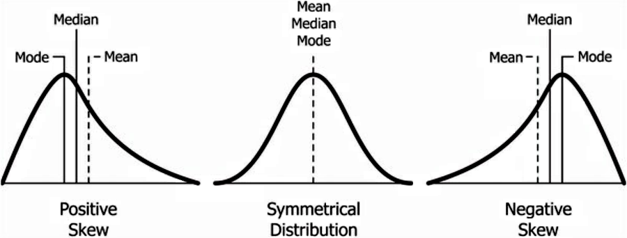
Shape
We often talk about skew when describing shape of data
– Positive Skew (Right Skew)
– Negative Skew (Left Skew)
– Roughlyl Symmentric
![]()
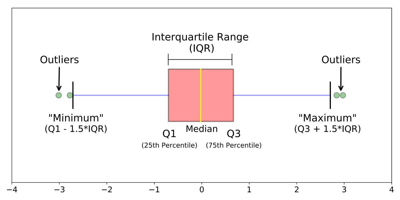
Outliers
A data point that does not follow the general trend of the data
![]()
Center
– What’s the mean
– What’s the median
Spread (More Coming Later!)
How spread out things are…
– Standard deviation
– IQR
Useful function of the day
names()
There are many ways we can extract variable names from our data set. I find myself using this a lot in practice.
ae-02-s23
These data were collected from 2007 - 2009 by Dr. Kristen Gorman with the Palmer Station Long Term Ecological Research Program, part of the US Long Term Ecological Research Network. The data were imported directly from the Environmental Data Initiative (EDI) Data Portal, and are available for use by CC0 license (“No Rights Reserved”) in accordance with the Palmer Station Data Policy.
https://github.com/sta199-summer-1/ae-02-summer
Recap of AE
Pick geoms based on data types.
Manipulate graphs to be more appropriate with arguments
Take control of your labels
Use color to your advantage. https://ggplot2.tidyverse.org/reference/ggtheme.html & https://ggplot2.tidyverse.org/reference/scale_viridis.html